Thursday 27 November 2008

Luxury Entertainment


Luxury Entertainment Logo

So i was thinking about things which symbolize luxury, importance, richness etc apart from the usual, big mansions, classy cars, jewelry etc. Heraldy, with a shield and animal figures with a banner, popped into my mind for the first draft of Luxury Entertainment's logo. Many animals were shown to my client, with this being the one chosen. Here's the final version. Black, Silver and diamond is the requested style.

Sunday 23 November 2008

Mock Movie Poster #2


Grindhouse Style Mock Movie Poster
Planet Terror

I wanted to try another mock movie poster, chose a different style, grindhouse vintage style. This was about a 30minute job as I was waiting for a lift lol so i didn't expect a WHOA outcome, just a try out.

Mock Movie Poster #1

Arise

This is my first attempt at a movie poster. 100% made up. It started with a previous edit I did of Amy Lee, turned her into a zombie and made this so it didn't go to waste. Afterall I'd love to go into doing movie posters!

The font is custom made by me. The style was supposed to be dark and textured. Sort of reminds me of the Chainsaw Massacre: The Beginning poster i saw somewhere.

I think it came out pretty well in the end.


Friday 21 November 2008

DJ-A


DJ-A Logo

This is my most recent logo i've done. Me and DJ A worked together via MSN for this project. It's mainly a re-work of his previous self made logo, and its a big improvement if I don't say so myself! In the first version I wanted to use a less usual looking A, which was a lot more rounded, with DJ incorporated onto it, however my client preferred a usual A style so that people could see it was an A straight away. The wings & headphones were also requested. The speakers were a little addition by me and the headphones were my first proper 'illustration' on illustrator. In the end the headphones didn't end up being seen that much as DJ A wanted the A to lo
ok like it was wearing the headphones. Overall its a simple looking sharp straight to the point logo. I like it and have had good feedback for it.

Wednesday 19 November 2008

SAW edits

The following edits were just done whilst i relaxed, ideas sparked by the SAW 'season' with the new SAW V being released in cinemas.

THE GAME
Has Just Begun
This was made a while ago. For mixtape fans... this was done before the leak V cover was out, people think that I did it because of that. No. Mine makes sense, you can't wear your own face as a mask... Yes that's 50's face (I had some people say 'what the hell.. game looks wierd' oh my..).


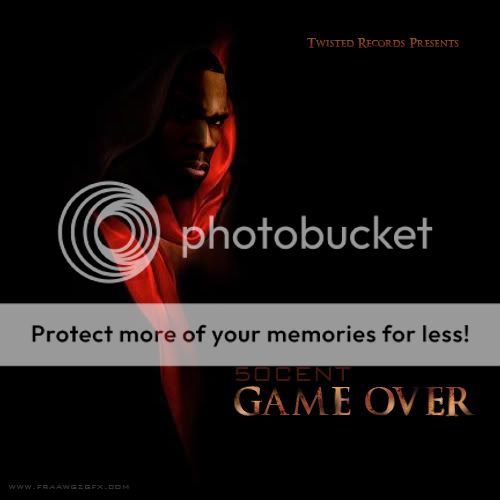
Game Over

This was made like an album cover. Its worked off the SAW III one sheet. Looks like I did some sort of Cartoon smoothing filter on it but nope, didn't touch any filters. This is the weakest of the three and was also done a while back, after i saw the Leak V cover actually.

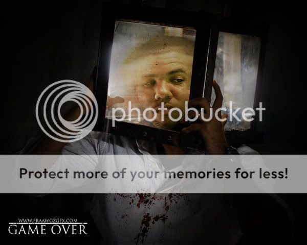
GAME OVER v2

Sorry the title's just work... Shame i couldn't find a picture of The Game with a little bit of strain on his face haha but oh well. This one is worked off a set picture & one sheet for SAW V. The skin tone on the arms didn't work 100% how i hoped but there is major difference compared to the original.


My favorite has got to the the first one. Out of all the SAW teasers that poster is also my favourite, oddly not as shocking as some of the others at first glance however it still managed to get banned in the UK. I missed seeing buses pass me with SAW teasers on them :(

The artists who make these SAW posters are God's to me. I love there work, creativity and exicution (of the work... not people).

Tuesday 18 November 2008

Secret Love 12

Rock The Nation Sound Presents Secret Love 12

For me a 'love' mixtape is a totally different style. With this cover i aimed to put a smirk on the face of anyone looking at it. It's just something about the guy's cheeky smile whilst holding up the picture behind his other girls back. With the back, there was just too much info to make the picture the back cover, as i originally planned. So i went for a totally different back cover, keeping the reggae colours.

Download/purchase a copy at: www.myspace.com/rockthenationunltd


Quality may be lower due to image being resized

Marvelous Mixtape

DJ Grind Presents
Marvelous
The Dopeboy Fresh Mixtape

This cover was done for UK up and coming rapper; Marvelous. The tape itself has pretty decent tracks on it and worth a listen. You can download from here. Everything on the table is a manipulation, yes... USD because for some reason us English don't take pictures of notes stacked up lol. The tennis chain was requested BAALLIINNN. Shame Grind in the background kept going different pinkish colors when i tried to blend him in more; i think its because of the light which was on him in the picture..


S.Dot Postcard Flyers

S.Dot's 'Sex and the Univercity' flyer

I did these a while back however I think they really came out great especially as i had less 'skill' back then. My client loved them and she told me her friends did also. I worked till my client was happy with them; unfortunately a few months after completion i found a typo :( See if you can spot it... is it that obvious?


S-Class Myspace Layout

S-Class Myspace Layout

Click image to view live myspace

Just finished with this layout yesterday (yay!) and i'm really pleased with the outcome. Its a 100% joint effort with me and the client, he kept his ideas flowing and knew what he wanted. For example the background is all his idea, exactly how he wanted it, just worked on by me. Then matched the rest of the layout with a dark/grugey metalic feel. This is my second proper flash banner i've done aswel, not too bad i don't think but i still have a long way to go! I will never stop learning.

Tafari Street Album Cover (Rock the Nation Sound)

Rock The Nation Sound Presents: Real Rude Bwoy Tafari

This was done for Massive G over at Rock the Nation Sound and Tafari. You should definitely check out the actual tape by downloading it here if you're into a mix of hip hop and dancehall. I really enjoyed doing this cover as its a very different concept compared to most covers you see. Obviously it revolved around a newspaper with circled areas (as you do...) for more highlighted text.


Download/purchase a copy at: www.myspace.com/rockthenationunltd